
How to design your garden with red
|
Red is a strong colour, demanding attention. It brushes aside more genteel and subtle blooms, often overshadowing or clashing with them. I love red, probably because it does command my attention. I am drawn to red flowers or red foliaged plants at nurseries and frequently trot them home. But my retinas have been seared more than once when a red has been incorrectly sited, and I’ve been driven to look for methods of incorporating the colour effectively.
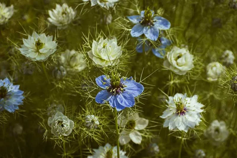
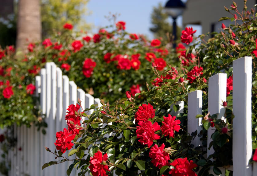
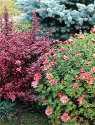
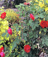
I’ve learned, for starters, that it helps to know something about the two sides of red. In his ground-breaking, 18th-century treatise, The Natural System of Colours, artist-naturalist Moses Harris shows how on one side of the traditional colour wheel red moves through red-orange, orange-red, orange and on through to pure yellow. On the opposite side of the wheel, blue moves gradually through the hues of purple, red-purple and purple-red until pure red is reached. Reds that lean toward the blue side pair well with blues, purples, pale pinks, soft yellows and oranges. Reds that have yellow in them mix well with the hotter end of the colour spectrum such as oranges, golds and even hot pinks. Yet burgundy, a reddish purple, operates as an exception. Burgundy is what the fashion industry would label a neutral. It looks fabulous as a contrasting background for golds, oranges and scarlets and looks equally at home with pastel pinks, blues, lavenders, yellows and white. Using burgundy-foliaged plants throughout a garden is a very effective way of creating cohesion and flow. Red plant combinationsA stunning vignette presents itself in spring when the tulip ‘Princess Irene’ comes into bloom: a swirl of purple and scarlet flames encircling an orange/gold cup. This tulip is planted en masse against a background of burgundy smokebush (Cotinus) at Victoria’s Butchart Gardens. I recreated the combination at home by planting my Princes Irene tulips in front of a Diablo ninebark (Physocarpus).The dark stems and leaves of the ninebark provide a similar contrast and give that jolt of colour we seem to crave in spring. One technique used with effect by Butchart’s is to play red off foliage. Green, chartreuse and burgundy make wonderful companions to red flowers, intensifying their jewel-like nature. In a distant border that needs some pizazz, one might pair Gold Nugget ninebark with either scarlet Rosa ‘Morden Fireglow’ or the deeper red ‘Linda Campbell’ and underplant the lot with the yellow-leafed Angelina sedum. This should certainly excite the senses, though it can prove too hot for some people when the summer heat arrives. However, plant combinations using burgundy as the predominant colour keep things cool. The garden could flower in spring in shades of pink, blue, cream, white, dusky red and some purple. Later, in summer, yellow, gold and terracotta would take over. Burgundy-leaved plants such as Diablo ninebark, Penstemon ‘Husker Red’, Sedum ‘Purple Emperor’, Lysimachia ‘Firecracker’ and burgundy-tinged highbush cranberry planted through the garden would provide a perfect contrast. In spring the effect is one of softness; in summer it’s much bolder, but the burgundy foliage will cool down the more intense colours. Note that though it’s tempting to add more and more burgundy foliage, too much looks dull and muddy. On the other hand, too many red flowers soon exhaust the eye. Reds are at their best when paired with contrasting colours, lots of green foliage and airy textures. Red plants can add life and character to your garden, but moderation will forever be important. |